Florence Nightingale understood the power of visualizing science
She illustrated that simple sanitation techniques could stop the spread of infectious diseases
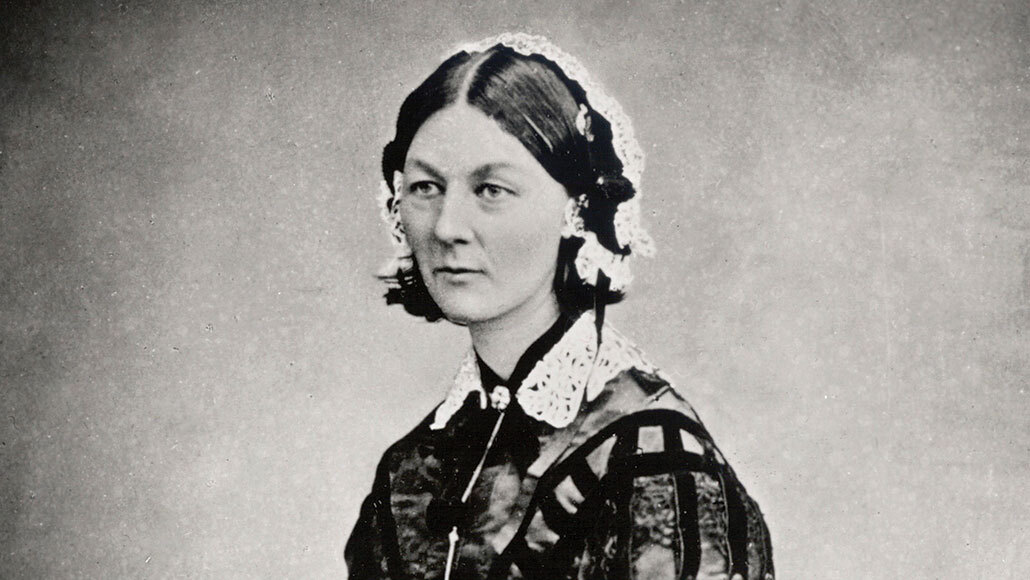
Florence Nightingale would have celebrated her 200th birthday on May 12.
INCAMERASTOCK/ALAMY STOCK PHOTO
Victorian icon Florence Nightingale is best known as the founder of modern nursing. But Nightingale, who would have celebrated her 200th birthday on May 12, was also a statistics and data visualization pioneer who sought to illustrate that simple sanitation techniques, such as handwashing, could stop the spread of infectious diseases (SN: 1/5/20). While that’s a particularly timely message given the ongoing coronavirus pandemic, it wasn’t one widely known, or even believed, in the mid-1800s.
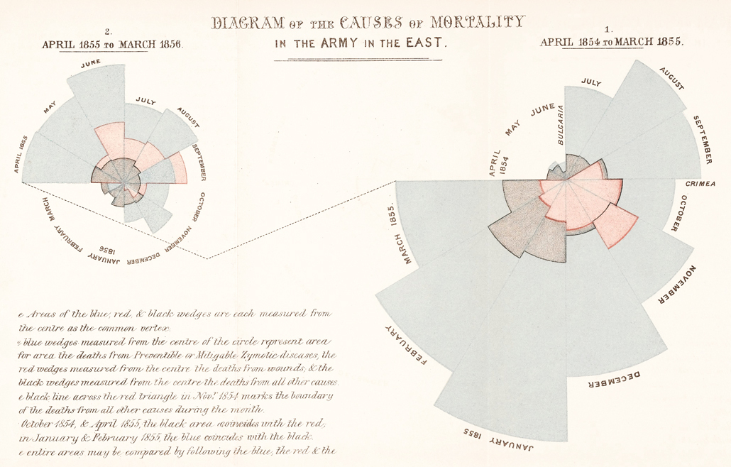
Nightingale’s best-known diagram is a variation of a pie chart known as a rose, or polar area, chart. In that diagram, she showed that poor sanitation, not battle wounds, lay behind most English soldiers’ deaths during the Crimean War in the 1850s and that such deaths were avoidable, says statistics historian Eileen Magnello of University College London. It “provided unequivocal evidential data that preventable contagious diseases could be eliminated.”
We summarize the week's scientific breakthroughs every Thursday.
To make the graph, Nightingale used data she and medical staff collected while caring for English soldiers in army hospitals and camps. She observed the soldiers’ horrific living conditions — dirty linens, clothes infested with lice and fleas, and rats hiding under the beds. Far more soldiers, she realized, were dying of diseases, such as cholera, typhus and dysentery, than battle wounds.
That graph wasn’t Nightingale’s only attempt at data visualization: She made a series of other charts to help convince the general public, medical staff and lawmakers that sanitation saves lives.
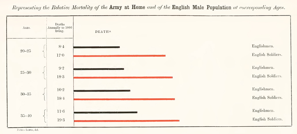
In one example, Nightingale showed that soldiers were much more likely to die of preventable diseases than male civilians, even during peacetime. She used a bar chart to show that soldiers, even during peacetime, were dying at roughly double the rate of civilians, due to especially bad sanitation in English barracks.
Nightingale was incensed by her finding, writing in 1857: “[I]t is as criminal to have a mortality of 17, 19 and 20 per 1,000 in the Line Artillery and Guards in England when that of civil life in towns is only 11 per 1, 000 as it would be to take 1,100 men per [year] out upon Salisbury Plain and shoot them.”
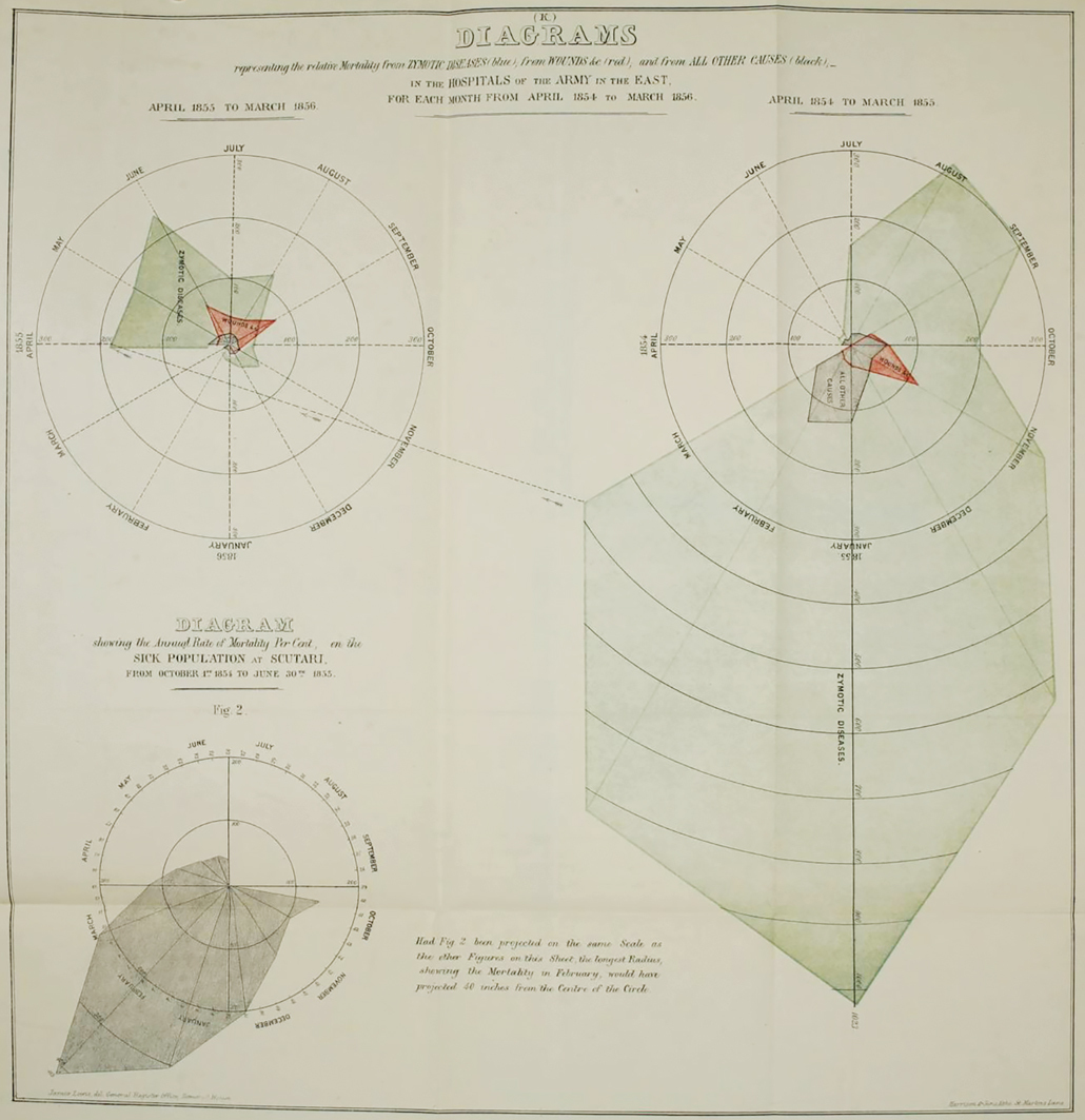
Other “bat’s wing” diagrams were precursors to the rose charts. In one example, Nightingale compares causes of English soldiers’ deaths during the Crimean War from April 1854 to March 1855 by month with deaths from April 1855 to March 1856. These diagrams were meant to show that sanitation efforts implemented in army camps and hospitals during the war dramatically cut soldiers’ deaths. The length of each radial line is proportional to the death rate for that month, with a large spike in deaths in January 1855.
But the text accompanying the diagrams suggested the shaded areas, not the radial lines, correspond to the death rate. Nightingale put an erratum on the figure and stopped using it, showing she arrived at her iconic rose chart through trial and, even, error.
Ultimately, Nightingale’s ideas around sanitation began to permeate public consciousness (SN: 11/26/08). Patients at military and civilian hospitals started receiving bedpans, access to fresh air and clean bed linens and bowls for eating. She later turned her attention to the health of soldiers in India. That work led to similar health and sanitation reforms in those overseas military barracks and improved sanitation, such as clean water supplies, in various locales around the country.
Visualizations became one of Nightingale’s preferred ways of communicating about the need for sanitary reforms to save lives, a sentiment she herself expressed in a letter dated August 1857: “Whenever I am infuriated, I revenge myself with a new diagram.”