When Florence Nightingale arrived at a British hospital in Turkey during the Crimean War, she found a nightmare of misery and chaos. Men lay crowded next to each other in endless corridors. The air reeked from the cesspool that lay just beneath the hospital floor. There was little food and fewer basic supplies.

By the time Nightingale left Turkey after the war ended in July 1856, the hospitals were well-run and efficient, with mortality rates no greater than civilian hospitals in England, and Nightingale had earned a reputation as an icon of Victorian women. Her later and less well-known work, however, saved far more lives. She brought about fundamental change in the British military medical system, preventing any such future calamities. To do it, she pioneered a brand-new method for bringing about social change: applied statistics.
When Nightingale returned from the war, she was obsessed with a sense of failure, even though the public adored her. Despite her efforts, thousands of men had died needlessly during the war from illnesses they acquired in the hospital. “Oh, my poor men who endured so patiently,” she wrote to a friend, “I feel I have been such a bad mother to you, to come home and leave you lying in your Crimean graves, 73 percent in eight regiments during six months from disease alone.” Without widespread changes in Army procedures, the same disaster could occur again, she worried.
So she began a campaign for reform. She persuaded Queen Victoria to appoint a Royal Commission on the Army medical department, and she herself wrote an 830-page report. Her stories, she decided, weren’t enough. She turned to William Farr, who had recently invented the field of medical statistics, to help her identify the reasons for the calamity and the necessary policy changes. He advised her, “We do not want impressions, we want facts.”
Under Farr’s tutelage, Nightingale compiled vast tables of statistics about how many people had died, where and why. Many of her findings shocked her. For example, she discovered that in peacetime, soldiers in England died at twice the rate of civilians — even though they were young men in their primes. The problem with the military health service, she realized, extended far beyond a few terrible hospitals during a war.
Furthermore, the statistics changed Nightingale’s understanding of the problems in Turkey. Lack of sanitation, she realized, had been the principal reason for most of the deaths, not inadequate food and supplies as she had previously thought. Deaths from disease began to fall only in March 1855, after a Sanitary Commission arrived in Turkey. They did what she could not do alone: They flushed the sewers, removed putrid animal carcasses that were blocking the water supply, replaced rotten floors and improved ventilation. Almost immediately, the mortality rate dropped from 52 percent to 20 percent.
As impressive as her statistics were, Nightingale worried that Queen Victoria’s eyes would glaze over as she scanned the tables. So Nightingale devised clever ways of presenting the information in charts. Statistics had been presented using graphics only a few times previously, and perhaps never to persuade people of the need for social change. In doing so, she ignored the express advice of her mentor, Farr. “You complain that your report would be dry,” he wrote to her. “The dryer [sic] the better. Statistics should be the dryest [sic] of all reading.”
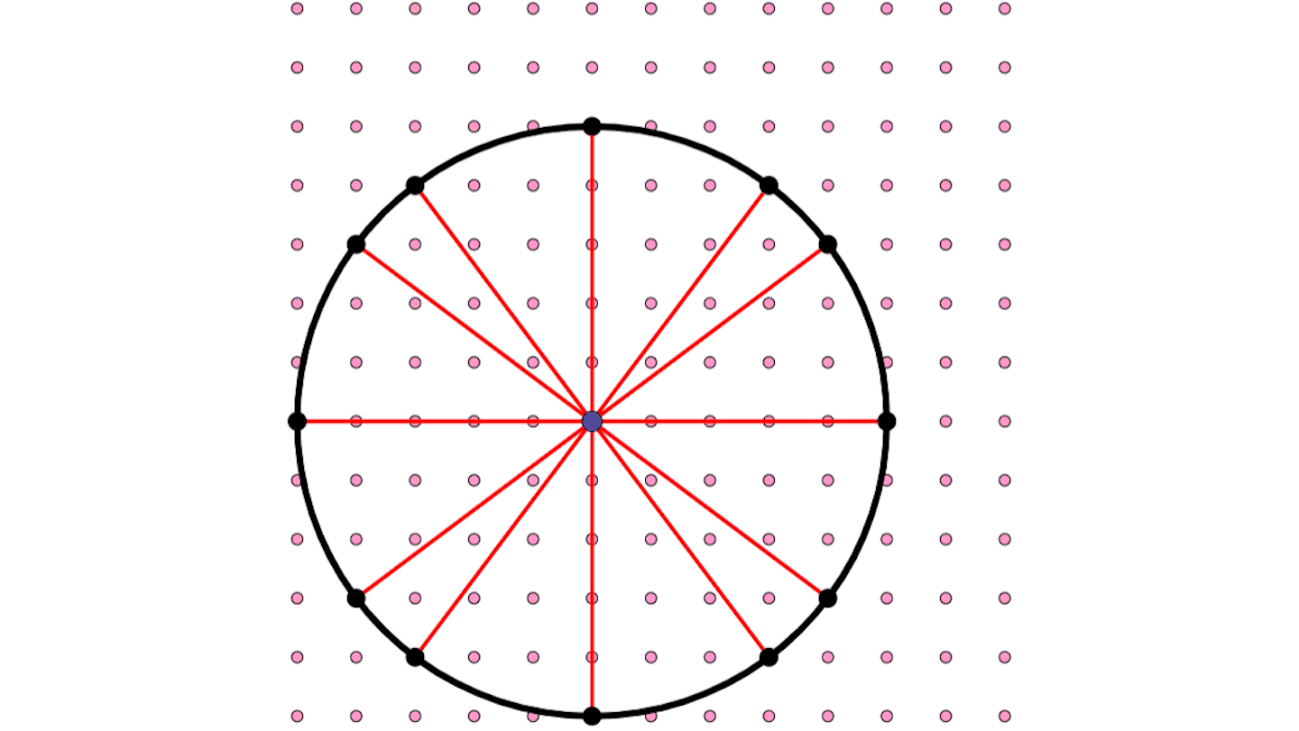
Nightingale’s best-known graphic has come to be known as a “coxcomb.” It is a variation on the familiar modern pie graph, showing the number of deaths each month and their causes.
Each month is represented as a twelfth of a circle. Months with more deaths are shown with longer wedges, so that the area of each wedge represents the number of deaths in that month from wounds, disease or other causes. For months during the first part of the war, the blue wedges, representing disease, are far larger than either the red ones (for wounds) or the black ones (for other causes). For months after March 1855, when the Sanitary Commission arrived, the blue wedges start becoming dramatically smaller.
The conventional way of presenting this information would have been a bar graph, which William Playfair had created a few decades earlier. Nightingale may have preferred the coxcomb graphic to the bar graph because it places the same month in different years in the same position on the circle, allowing for easy comparison across seasons. It also makes for an arresting image. She said her coxcomb graph was designed “to affect thro’ the Eyes what we fail to convey to the public through their word-proof ears.”
Some argue that a bar graph would have made her point more dramatically, though. One of the peculiarities of Nightingale’s circular presentation is that the deaths are proportional to the area, not the radius. Since the area of a circle is pr2, the area is proportional to the square of the radius rather than to the radius itself. This difference tends to de-emphasize the contrast between the small areas and the large ones. (In an early version of this diagram, Nightingale didn’t catch this distinction and drew the graphic incorrectly, with the radii proportional to the deaths. She quickly corrected her mistake.)
Her report and commission had an enormous impact, leading to systematic changes in the design and practices of hospitals. By the end of the century, Army mortality was lower than civilian mortality.
Furthermore, statistics has become a powerful tool for reform. And powerful graphics like Nightingale’s have spared the eyes of many more than just Queen Victoria’s from glazing over.
CLICK IMAGE BELOW FOR AN ANIMATION Animation credit: Ian Short at understandinguncertainty.org