The seemingly unending election cycle may have left you battle-weary and bleary-eyed, but that’s not why physicist Mark Newman’s election maps look distorted. He makes cartograms, maps in which familiar shapes are morphed to represent something other than just area.
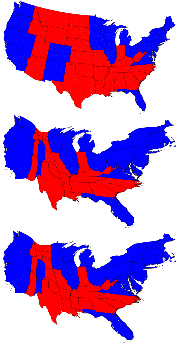
In a normal map (top), it’s hard to tell who won the 2012 presidential election; in fact, the map looks dominated by red. But using an approach that treats population as a diffusing fluid, Newman, of the University of Michigan, made election maps that visually represent the distribution of votes (popular vote in middle, and electoral votes at bottom).
In the cartograms, state size is shaped by population numbers, so in the popular vote map Rhode Island is about twice the size of Wyoming. While Obama did win the overall popular vote, it’s the electoral college that matters: Note in the bottom map that least-populated states Wyoming and Vermont have nearly doubled in size from the population representation.
View county-level cartograms at Newman’s site.