Pinning down malaria’s global reach
Local governments and organizations that fund malaria research need proper maps of its spread to allocate resources effectively, but it has been 40 years since scientists last cobbled together an accurate worldwide view. Using data from more than 4,000 clinical surveys from 2002 to 2006, researchers have now assembled the up-to-date map shown here.
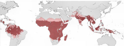
Red shading identifies zones where people live at high risk of malaria caused by the parasite Plasmodium falciparum, which causes the most severe disease.